Case Study
Journey feature for 9 Spaces
In a nutshell
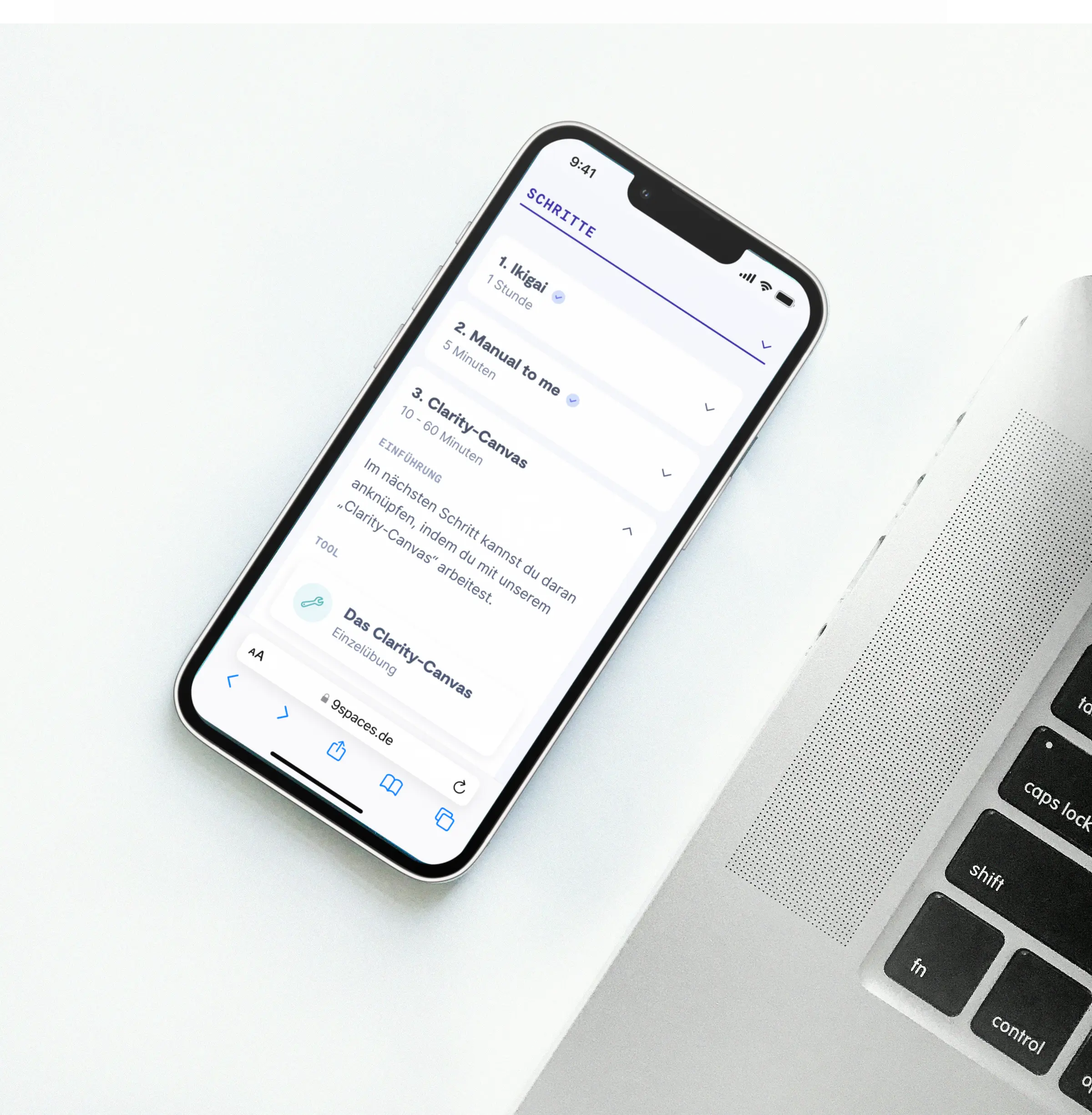
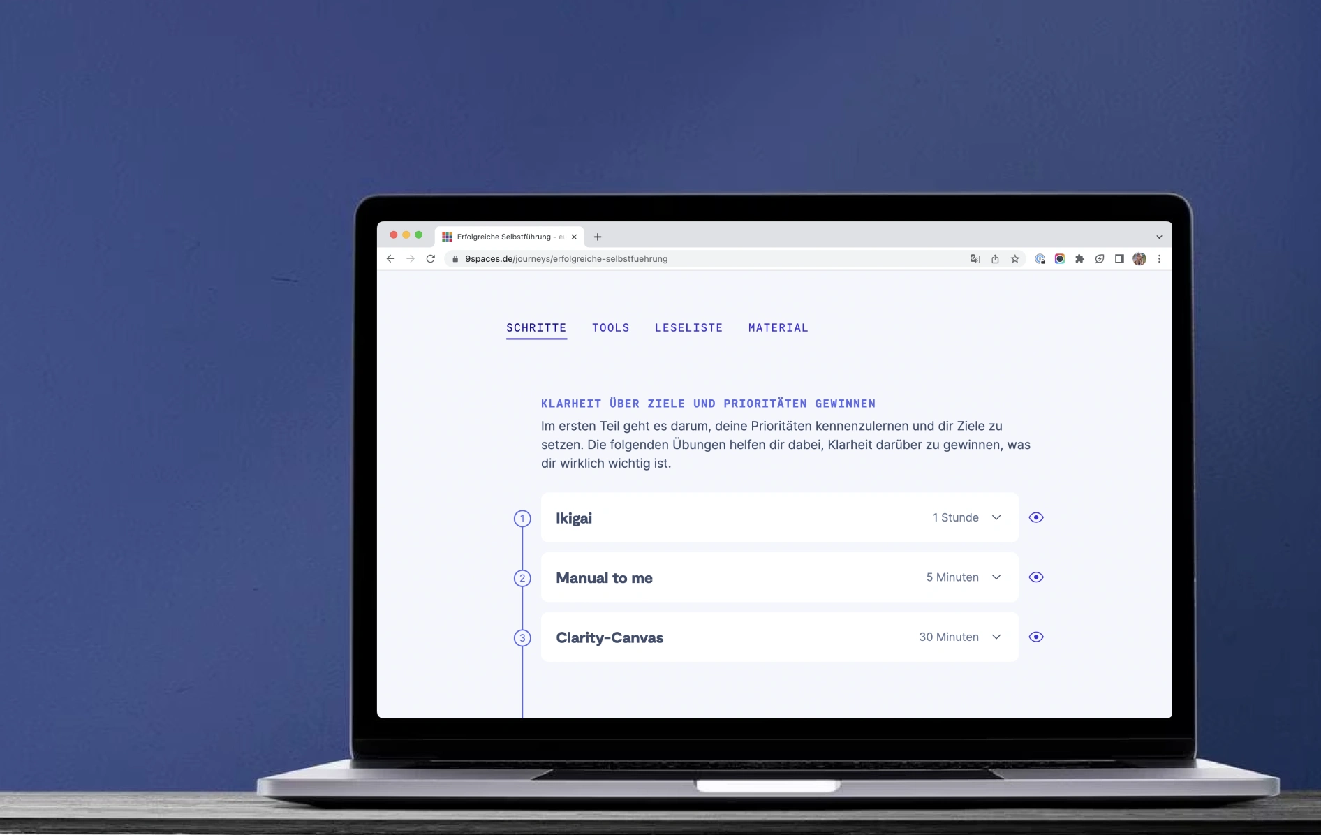
I designed a new feature for the tool platform 9 Spaces that allows to craft rich and guided learning experiences for specific workplace problems.
Background
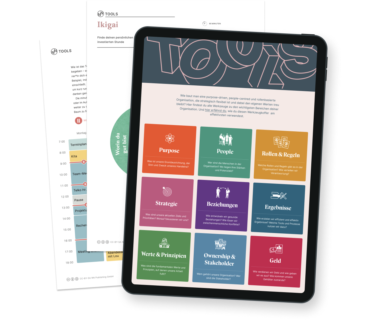
9 Spaces is an online platform offering tools, methods and material for teams who want to improve the way they’re working, no matter if it’s meetings, feedback or organisational structures. The platform was started in 2021 by the makers of Neue Narrative, a print magazine about new work.
Problem
When I joined the team, 9 Spaces counted about 60 tools with more coming every month. However, our customers told us they sometimes lack guidance. They had questions like “Where should I start?“ or “What is the right tool for my problem?” So we started to develop a feature that helps users with specific questions and guides them step by step to the solution.
My role
Provided with a rough idea, I took over the project, defined the requirements, iteratively designed and tested the user experience as well as supported the launch and marketing campaign. Since at Neue Narrative everyone works self-organised without any managers, I was responsible for all product- and design-related decisions.
The name of the new feature was set early on and didn’t change until launch: Journeys. It reflects that users will follow a path with several stations when transforming their way of working.
Approach
Understanding user needs and framing the solution
First I digged deeper into the customer feedback that sparked the idea in the first place. I also met with colleagues from the content team. Since they were the ones writing tools and creating journeys in the future, I wanted to better understand their needs and what the ideal journey should look like.
Product goal
A proven set of tools in a linear structure and with additional content to help users guide themselves through complex change processes.
Getting frequent feedback and filling empty data points
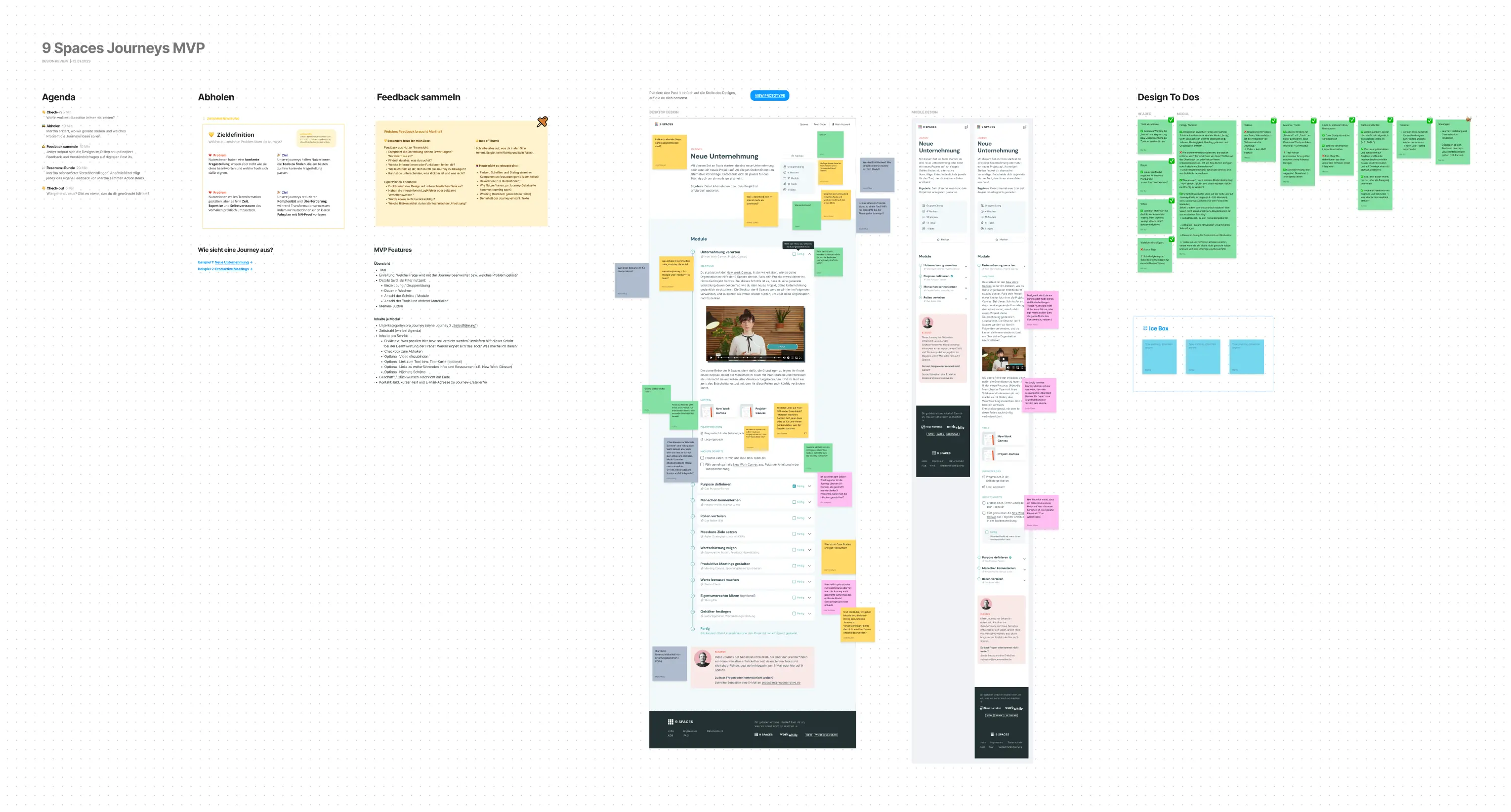
The design went through countless iterations while I regularly asked the content and product team for feedback, organised design review workshops and conducted user tests. The main challenge was that we had a lot of ideas for the feature, but the content wasn’t ready yet. So I made things up to test if my designs meet the requirements and to provide users with a realistic prototype during user testing.
Introducing a new visual identity and design system
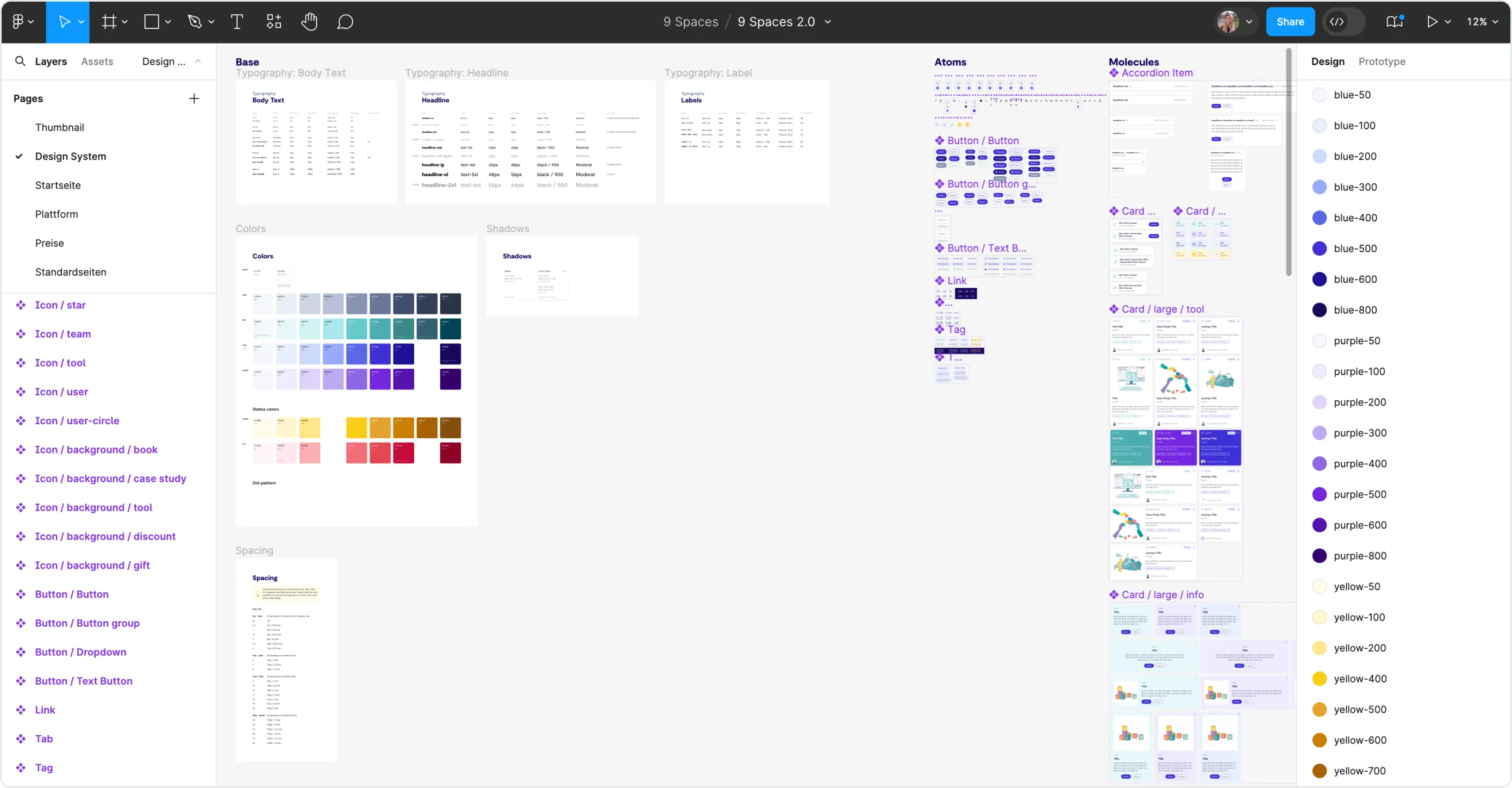
The journey feature offered a chance to improve UI design and set up a design system. A new design was needed anyway in order to bring more interactivity to the platform (I wrote a separate case study about it). The journey feature served as a testing field for new components while I developed the new design system along with it.
Improvements based on user feedback
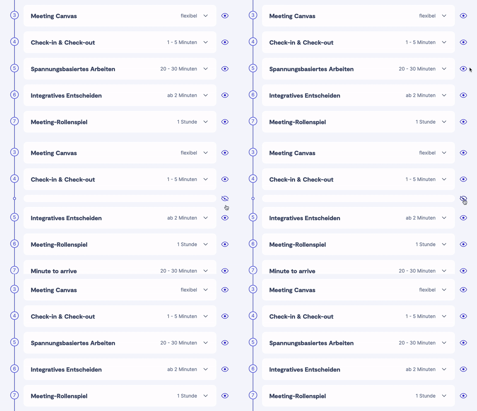
During the user tests, I learned that users appreciated the clearly structured and linear format of the journeys, but still needed flexibility to adjust them to their situation. I therefore integrated a show/hide functionality so that users can simply skip steps they don’t need.
Making it real and preparing the launch
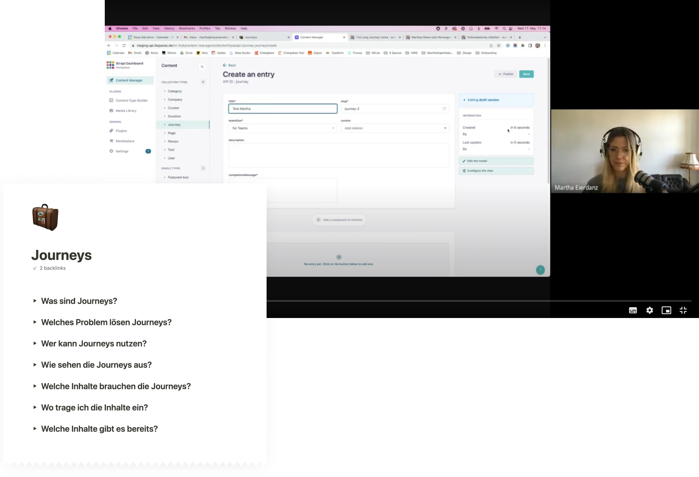
A few weeks before the launch, I made sure everyone and everything is prepared. I supported the marketing team with the launch communication and the content team with the journey creation. I documented important knowledge, gave an CMS onboarding, proof-read texts, improved consistency and identified design tasks for upcoming iterations.
Result
In June 2023 we launched the feature with three journeys on self-leadership, strategy and productive meetings, followed by a webinar for interested users in July. Since then, we regularly receive positive feedback from our customers.
