Case Study
Redesign and design system for a tool platform
In a nutshell
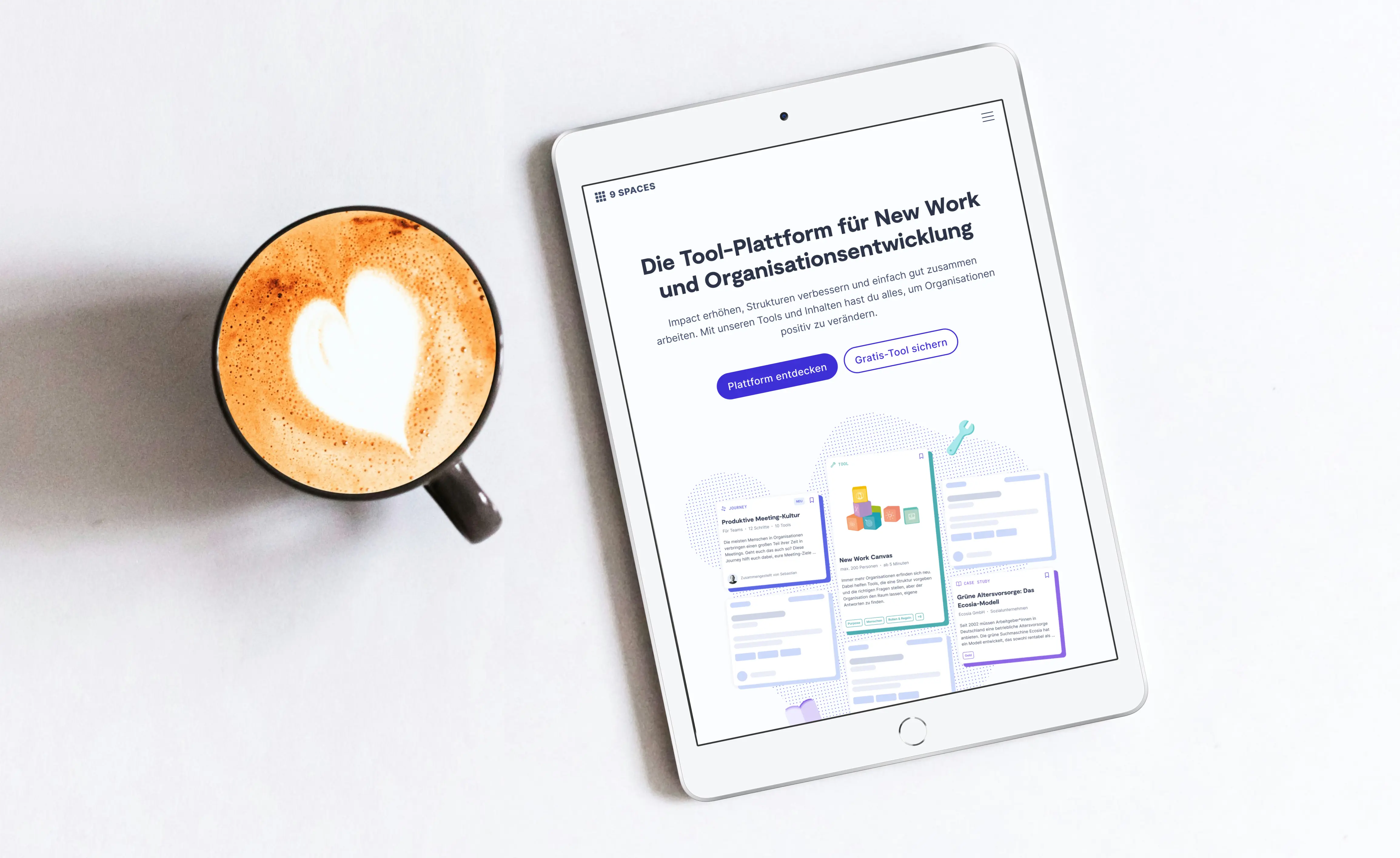
I redesigned the user experience of 9 Spaces to enable rapid prototyping, allow for information density and establish a brand that speaks to professionals in the new work field.
Background
9 Spaces is an online platform offering tools, methods and material for teams who want to improve the way they’re working, no matter if it’s meetings, feedback or organisational structures. The platform was started in 2021 by the makers of Neue Narrative, a print magazine about new work.
Problem
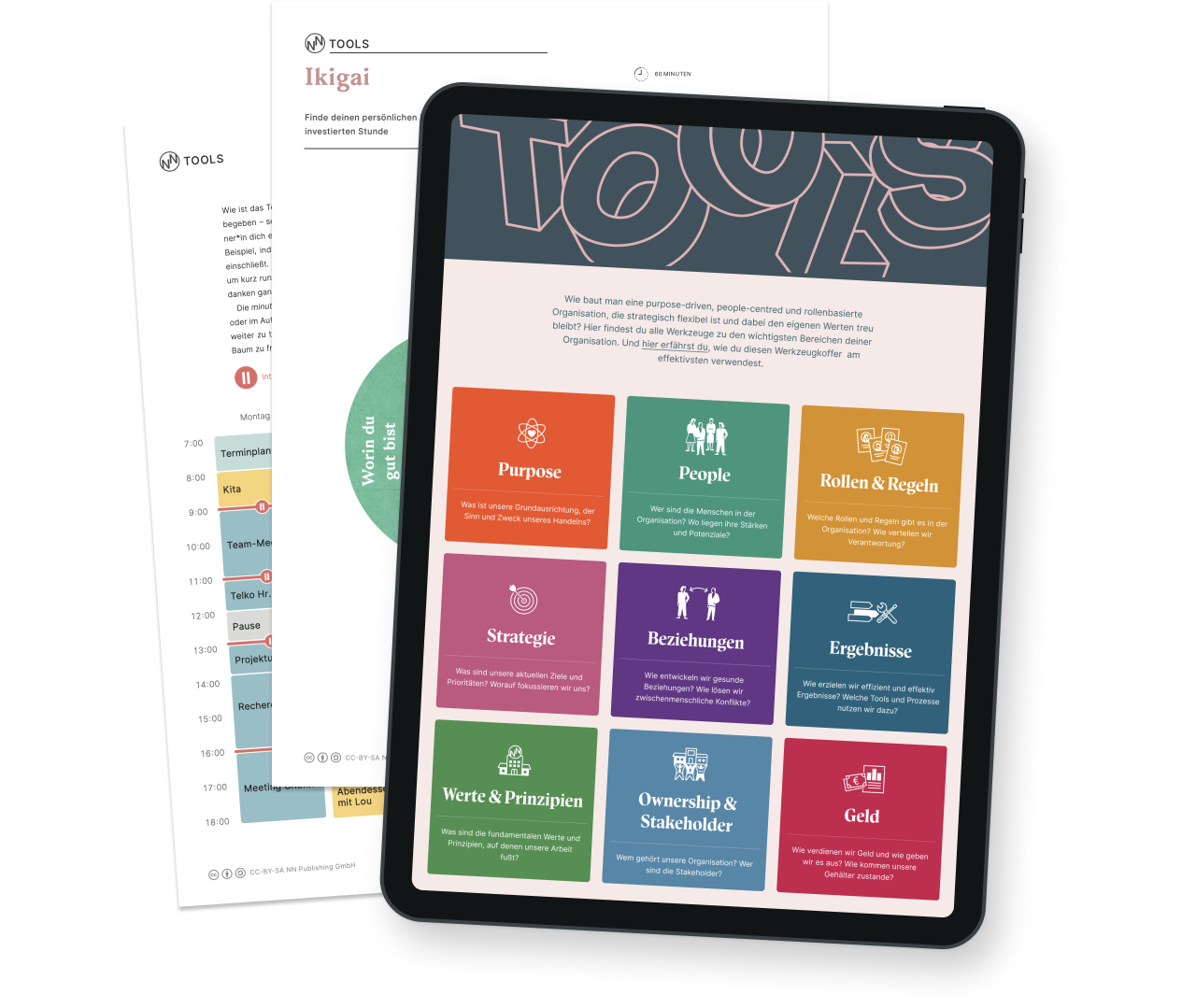
9 Spaces launched with the style of the print magazine. However, it soon became obvious that the design wasn’t ready for the ideas the team wanted to realise. Also information hierarchy, user journeys and conversion flows weren’t designed from a user perspective.
So they brought me in to create a design system and a user experience that grows 9 Spaces into a powerful digital product for teams and professionals.
My role
Since we were a small team of just two developers and designers, product management, quality assurance and user research were my responsibilty besides design. Shortly after I joined the team, I took over strategic responsibilites, crafted a product vision and figured out what to build and when to build it based on customer insights.
Approach
I redesigned the platform page by page and component by component, starting with the areas that were most crucial for users and the company’s adoption goals.
1. Research
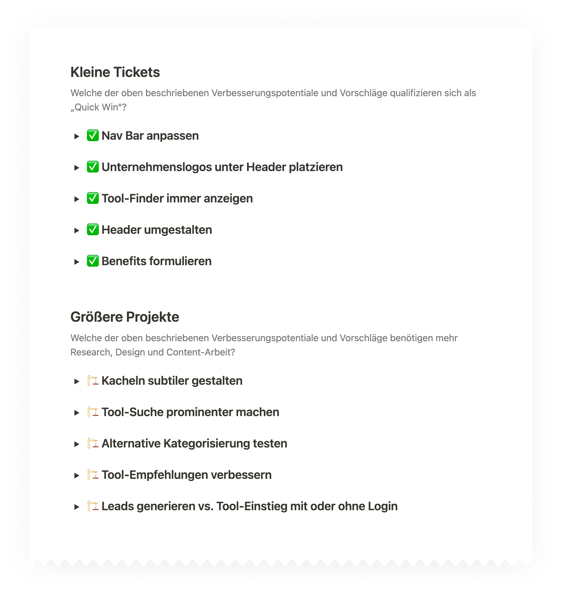
I did an heuristic evaluation and conducted user tests on the live product. Based on the findings, I identified areas for improvement and prioritised them based on impact and effort. Some improvements were small fixes that went directly into the backlog. Others became projects that needed more discovery and ideation. I worked closely with customer, marketing and sales roles to identify further problems.
2. Information architecture and interaction design
The research findings made clear that changes on the surface won’t be enough. There were too many steps holding users back from accessing the tools they need and buying a subscription. Many user flows had been designed to generate leads rather than giving users what they came for. This led to a redesign of pretty much all pages.
Homepage
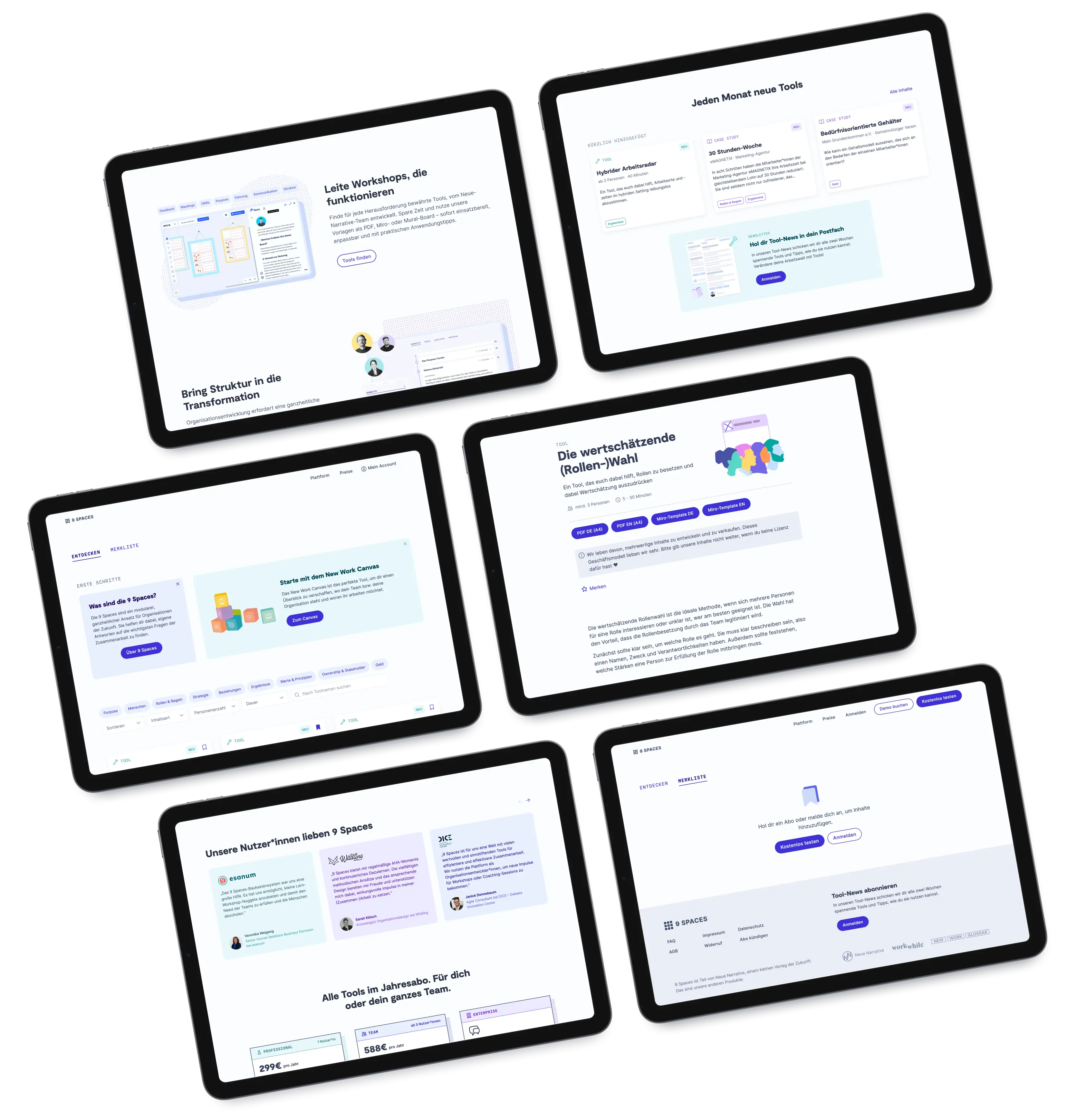
The homepage is often the first touch point between users and the product. Yet on the original homepage, users had to scroll beyond the header and find a hidden button to see what 9 Spaces has to offer. I restructured the homepage, rewrote copy and created images to get across the value proposition and guide users directly to content and subscription.

Search
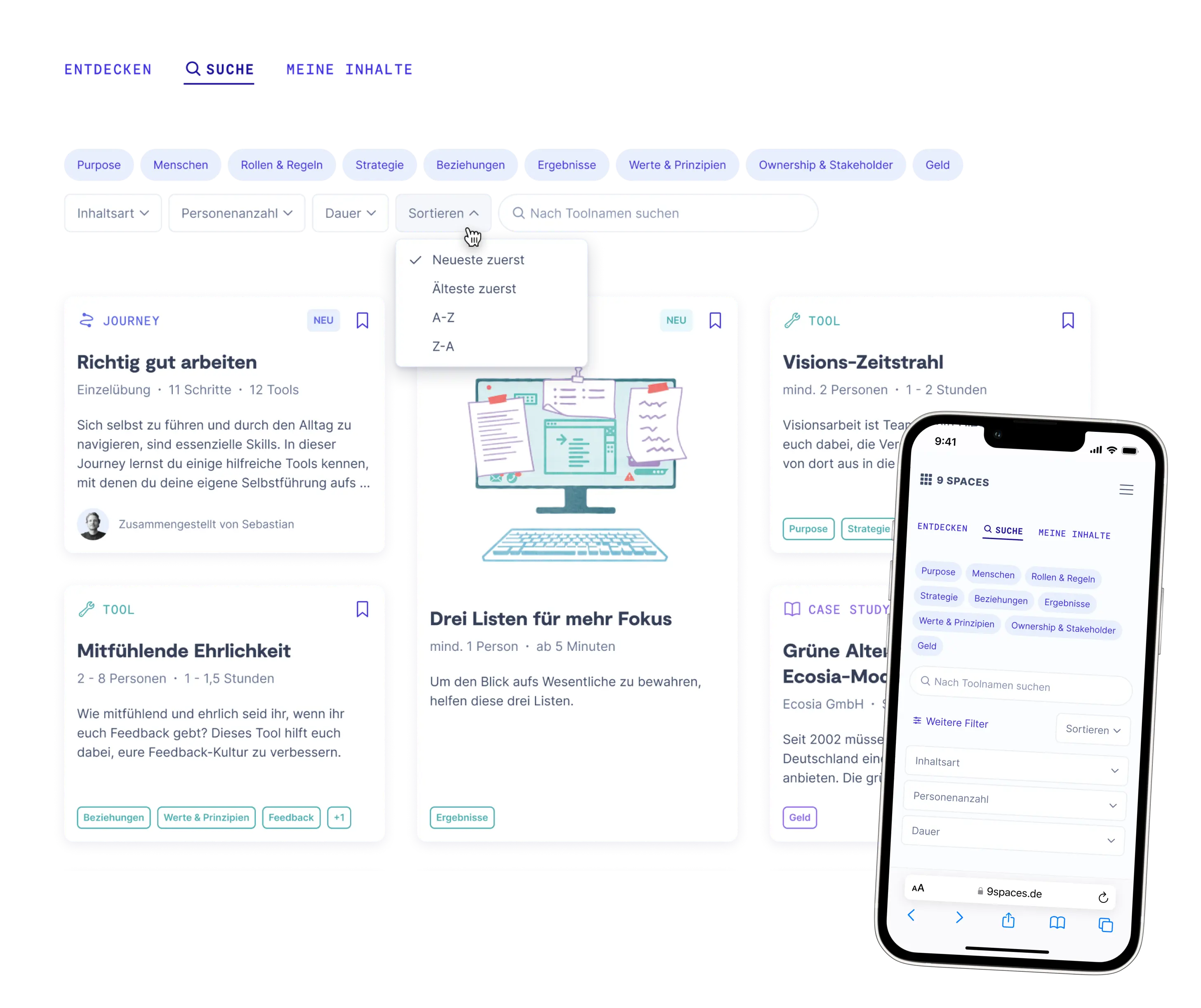
Before the redesign, search and filters were scattered across different pages. I merged two pages into one providing a better search experience with new filters, a new card layout and a section for personal bookmarks. During testing, users appreciated the improved discoverability and minimalist styling.
Pricing
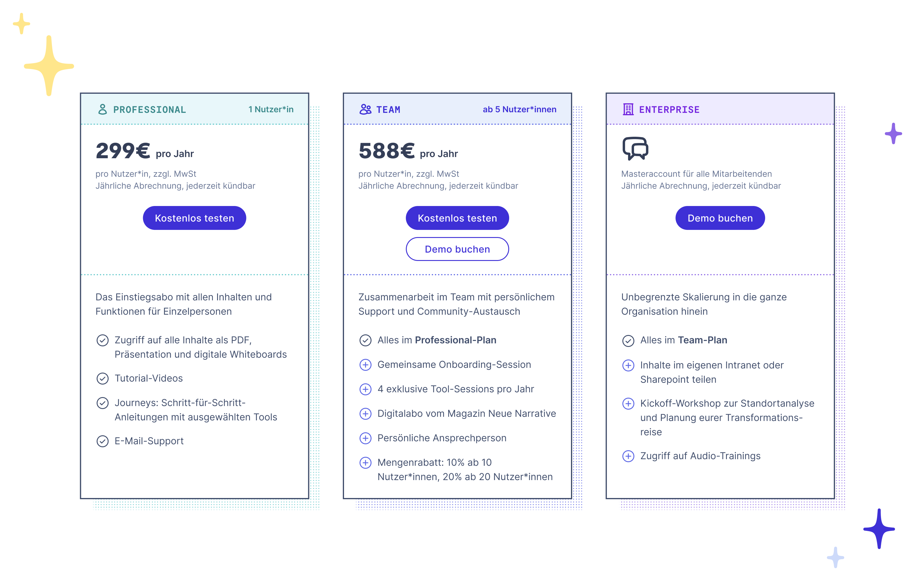
Users were not sure which subscription is right for them, so they ended up in the wrong subscription or booked demo calls that were meant for bigger teams. Together with the sales team, I made the different subscription plans more distinguishable and CTAs clearer to different user types.
3. Brand design workshop
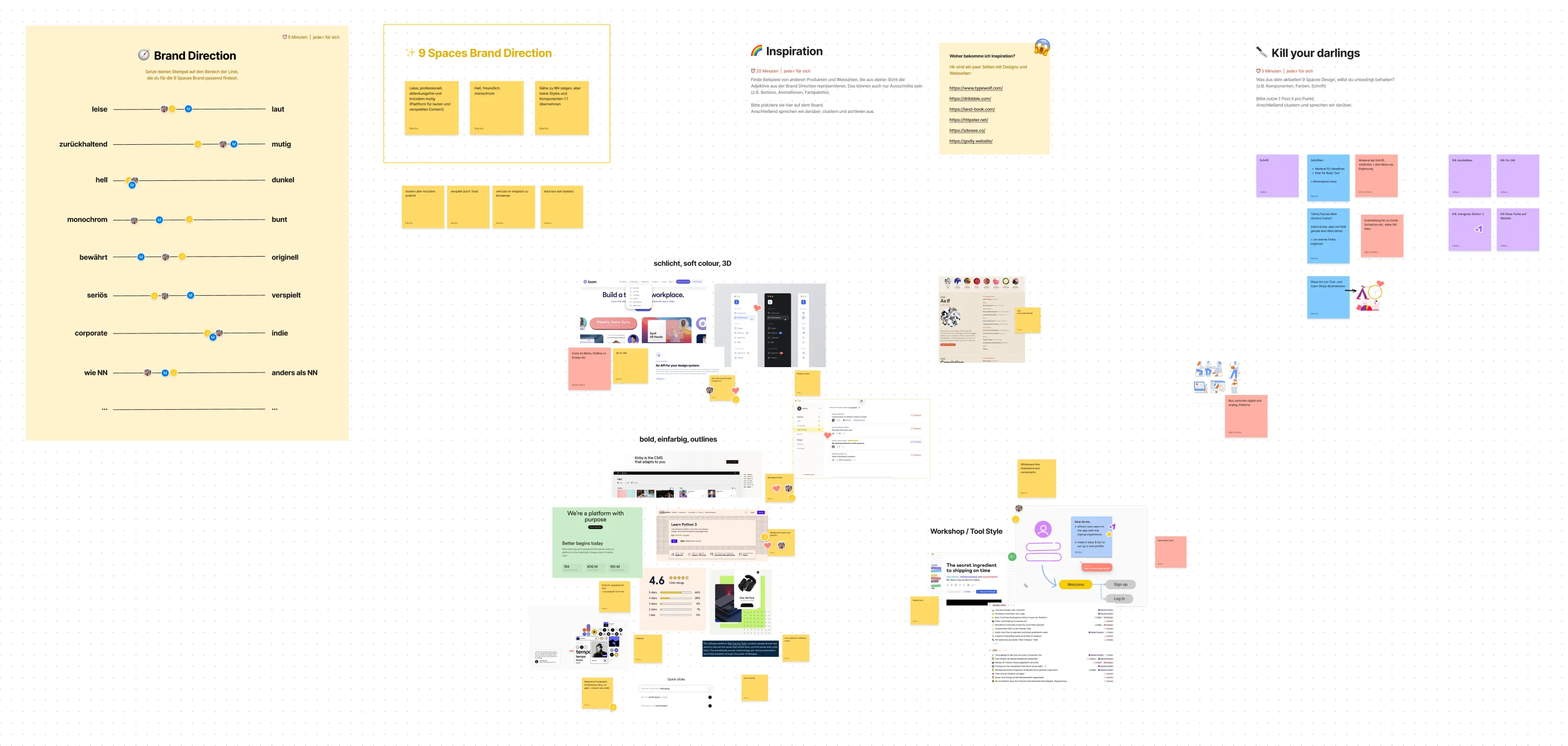
I facilitated a workshop with my team members to identify the new visual direction for 9 Spaces. The result was a light, clean but yet playful tonality that takes itself back and puts focus on the content. With the new colour scheme, contrast and thus accessibility was improved.
4. Atomic design system
During the redesign I developed the design system using tailwind classes. While the first new screen designs came with many new components, the later ones were extremely fast to create because existing components were reused.
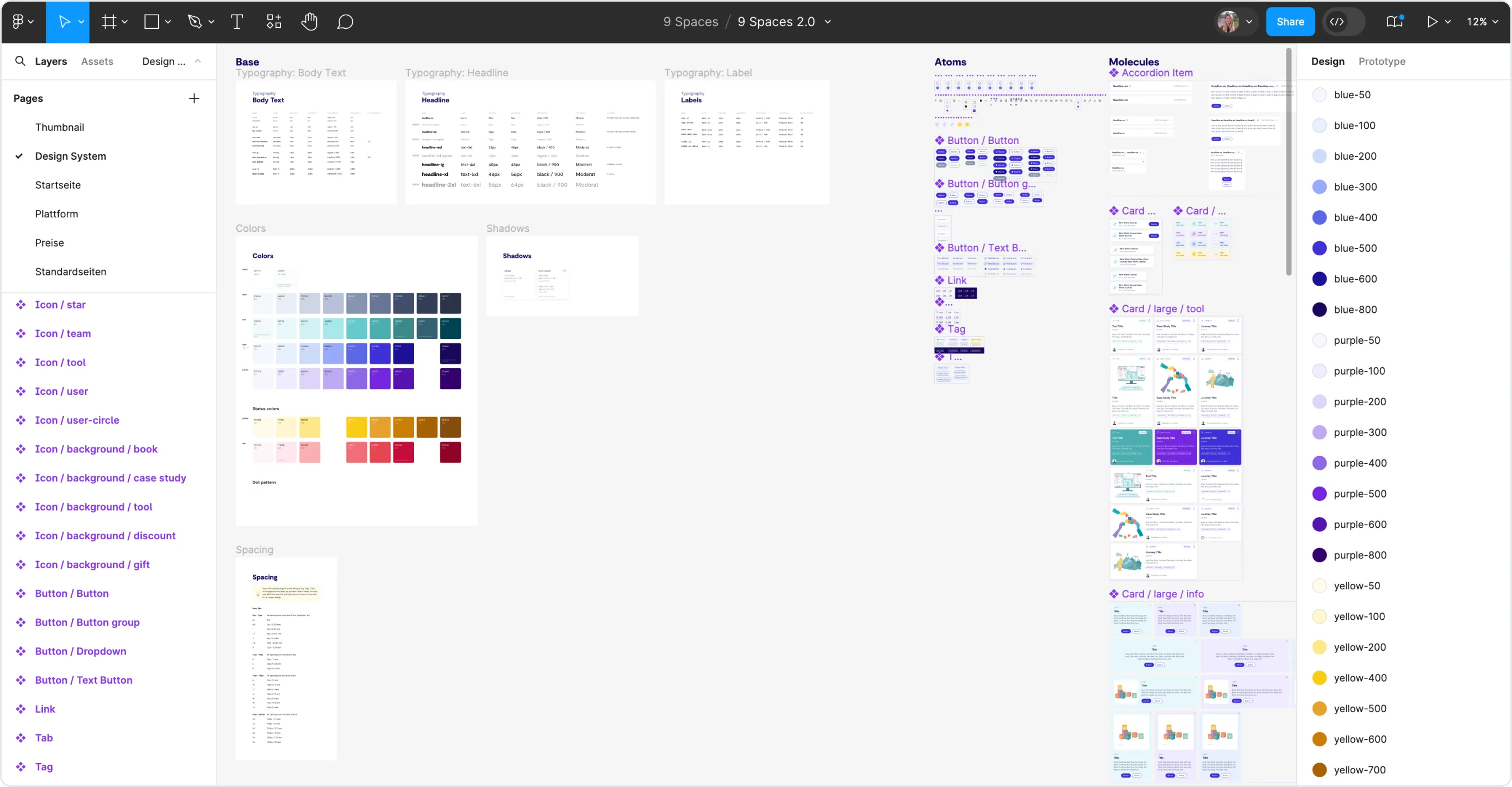
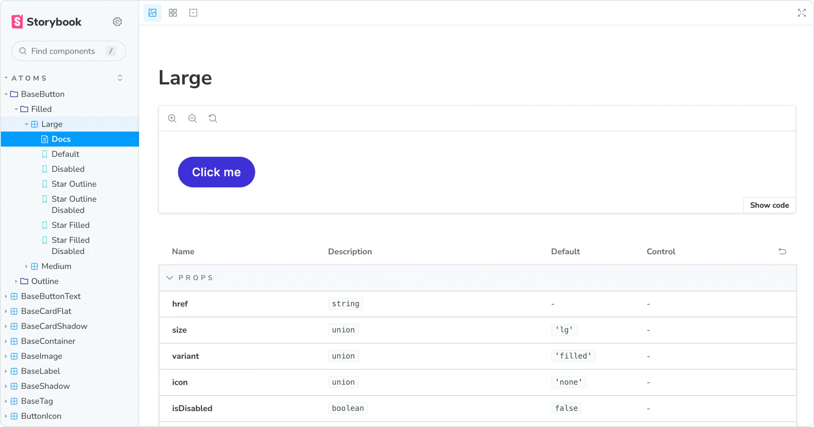
I paid special attention to create components that can be both used for shiny marketing content as well as task-oriented interactions and dense interfaces.
Result
9 Spaces now has a state of the art design system that makes it incredibly fast and fun to work with. New screen designs can be created at rapid pace and always look consistent. The new compontent library keeps development work low and reduces debt. Last but not least, user flows are optimised to meet users’ needs and drive conversion. The redesign was rolled out step by step during 2023 and 2024.
