Case Study
Newsletter redesign for Sofar Sounds
In a nutshell
Sofar’s monthly newsletter needed a redesign that provides users with a better experience, drives traffic to the website and increases event ticket sales.
Background
Sofar Sounds (short Sofar) offers secret intimate music events in over 300 cities around the world. Users can apply for events and get selected in a raffle before they can purchase tickets.
Sofar’s monthly newsletter is sent to a global audience of over 300,000 people, announcing Sofar events in the upcoming month and being an important touch point for selling event tickets.
Problem
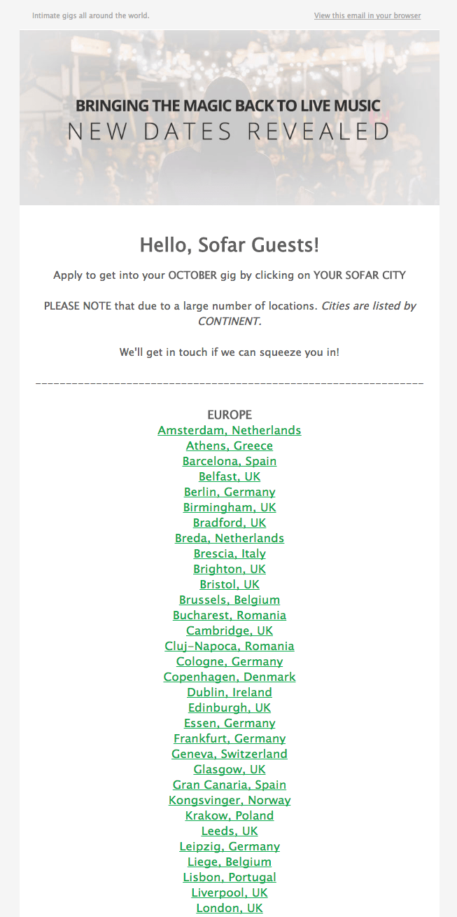
Since there are too many events to announce in a single newsletter, the email contained links to the cities where events will take place. The list still remained long, hard to skim with a lot of irrelevant content and mobile-unfriendly, while 60% of users opened the newsletter on their phone. Another issue was that the list had to be updated manually every month.
The goal of the redesign was to replace the manual process with an automated one on the one hand and to increase conversion and event page visits by 5% on the other hand.
Approach
Validating problems and expectations
After taking a look into analytics, I sent a survey to all newsletter subsribers asking them for their feedback and expectations.
Besides the obvious problems – hard to find city link and not seeing events right away – we learned that users miss editorial content about artists and recent events.
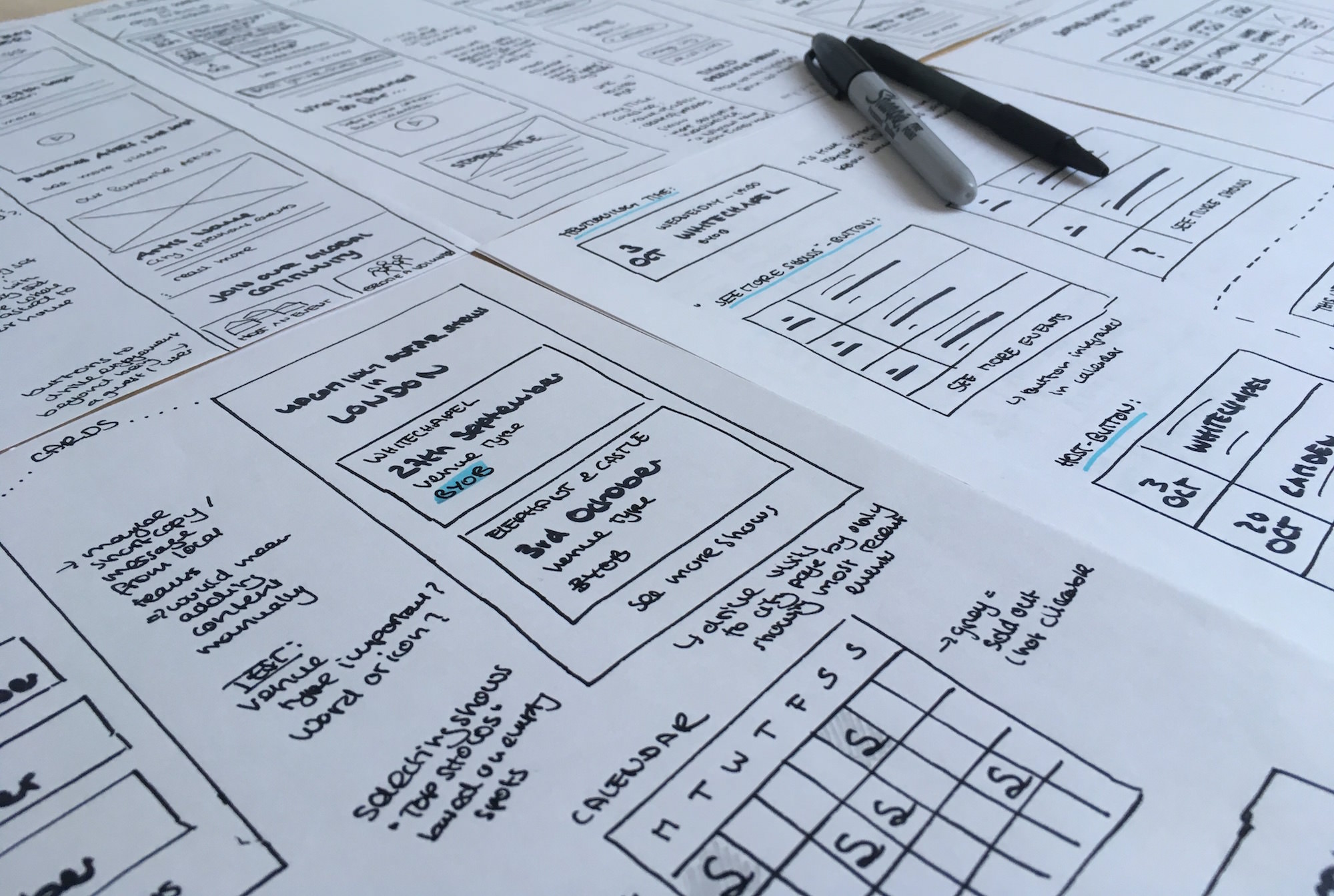
Prototyping with real data
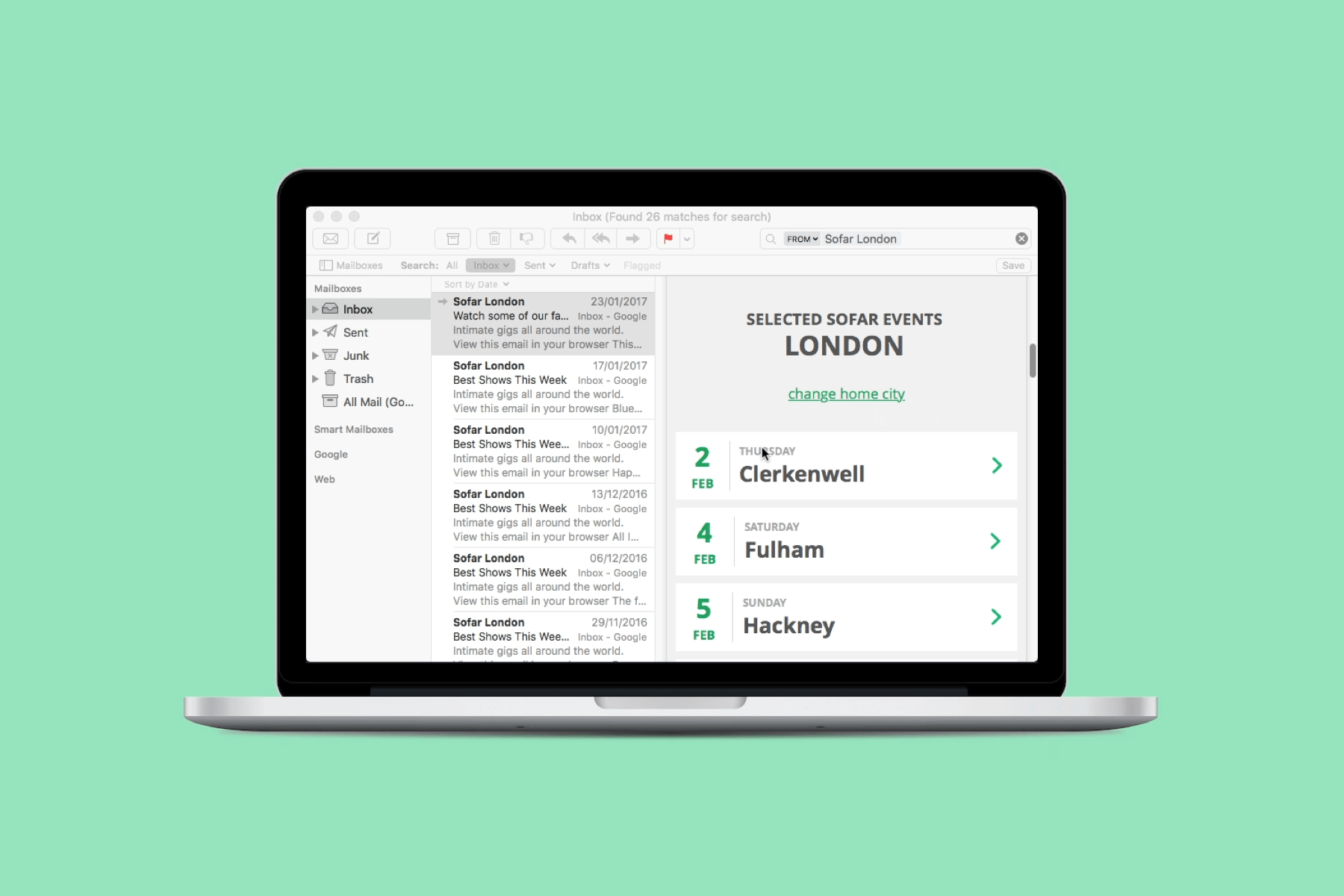
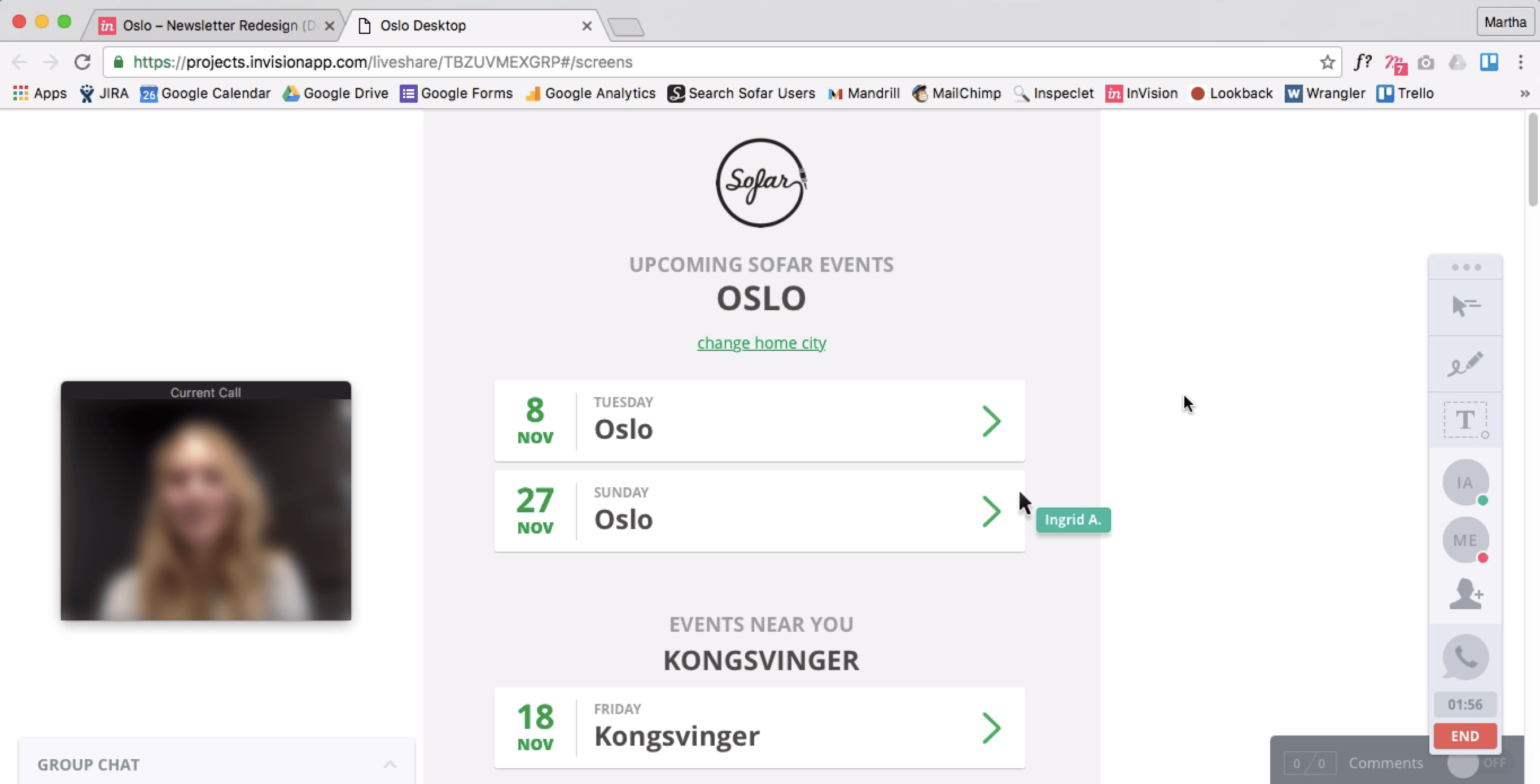
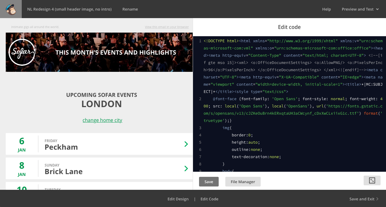
What to build was clear: A newsletter tailored to the user’s home city showing event dates and interesting content about artists.
It was important to design with real data from the beginning since number of events and information provided per event varied by city. The design had to work for different scenarios.
Testing remotely and in-person
I tested these different scenarios with users all around the world – from cities with 50 events a month to cities with 1 event a month to cities that offered no events at the moment. To get as much qualitative feedback as possible, I chose a combination of user testing and in-depth interview.
A/B testing new designs
After insights from the interviews were incorporated into the final designs, we tested 5 different variations of the new design against the current newsletter in an A/B test using MailChimp.
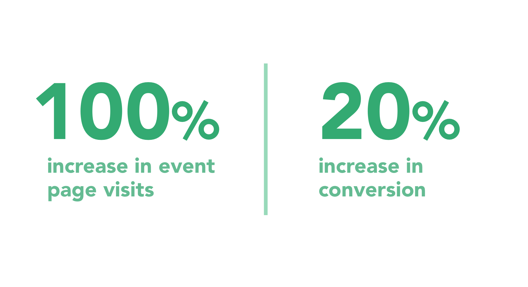
Result
Based on our A/B test, the redesign doubled the number of visits on event pages by removing just one crucial step between users and their end goal, that previously caused more than 50% drop off.
More importantly, 20% more users applied for an event coming from the new design since they now had direct access to events and a pre-selected number of options to choose from.