Case Study
Data visualisation and internal tooling for Civey
In a nutshell
I designed a feature that allows to build simplified charts with selected data points so that clients can easily understand and draw insights from their data.
Background
Civey is an opinion research company that conducts surveys for organisations from all kinds of industries to help them make data-informed decisions. The results are presented as charts on a web dashboard. My team’s focus was making these charts and dashboards meaningful and easy to understand for our clients, no matter how much research expertise they have.

Problem
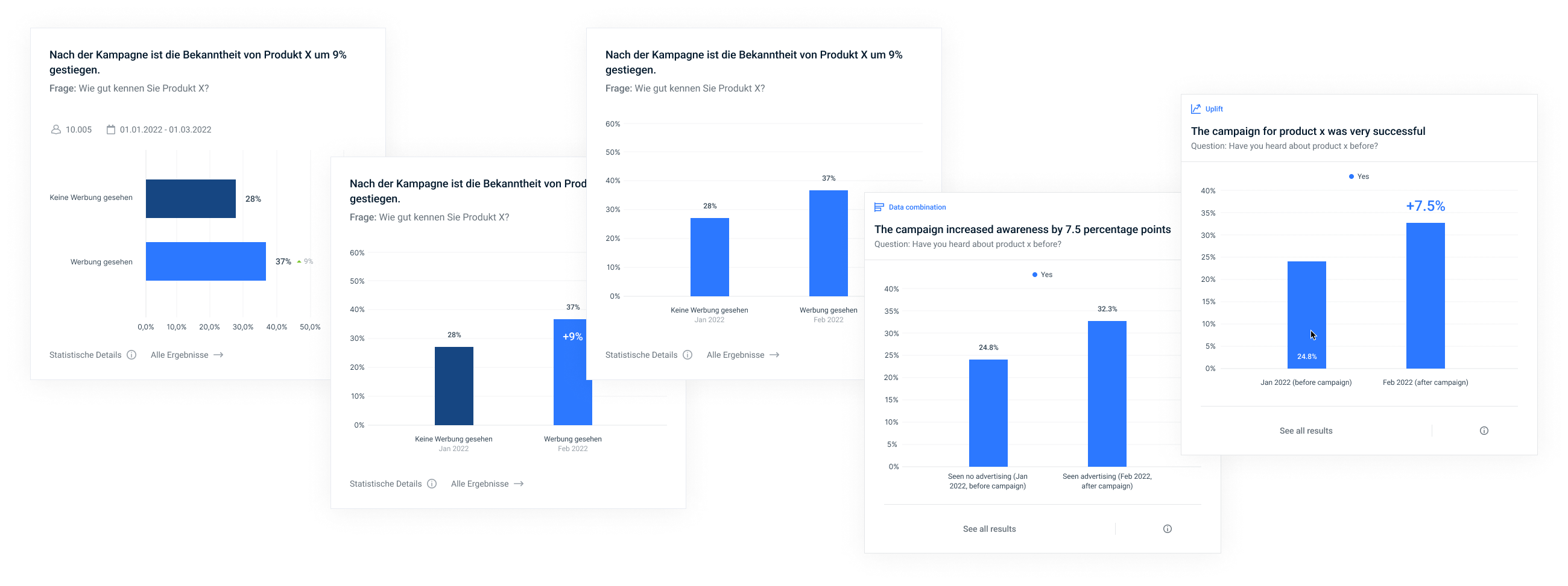
While charts are automatically generated based on their underlying data, Civey’s internal consultants can configure them in a way that clients get the answers they are looking for. Yet they were lacking tools to effictively convey messages with one chart. They either had to display more information than necessary which made it hard to compare data and extract insights. Or they had to present information outside of the dashboard which led to multiple sources of truths and a confusing experience for the client.
We needed a solution that allows to build charts with selected data points, conveying exactly the message that should be conveyed.
My role
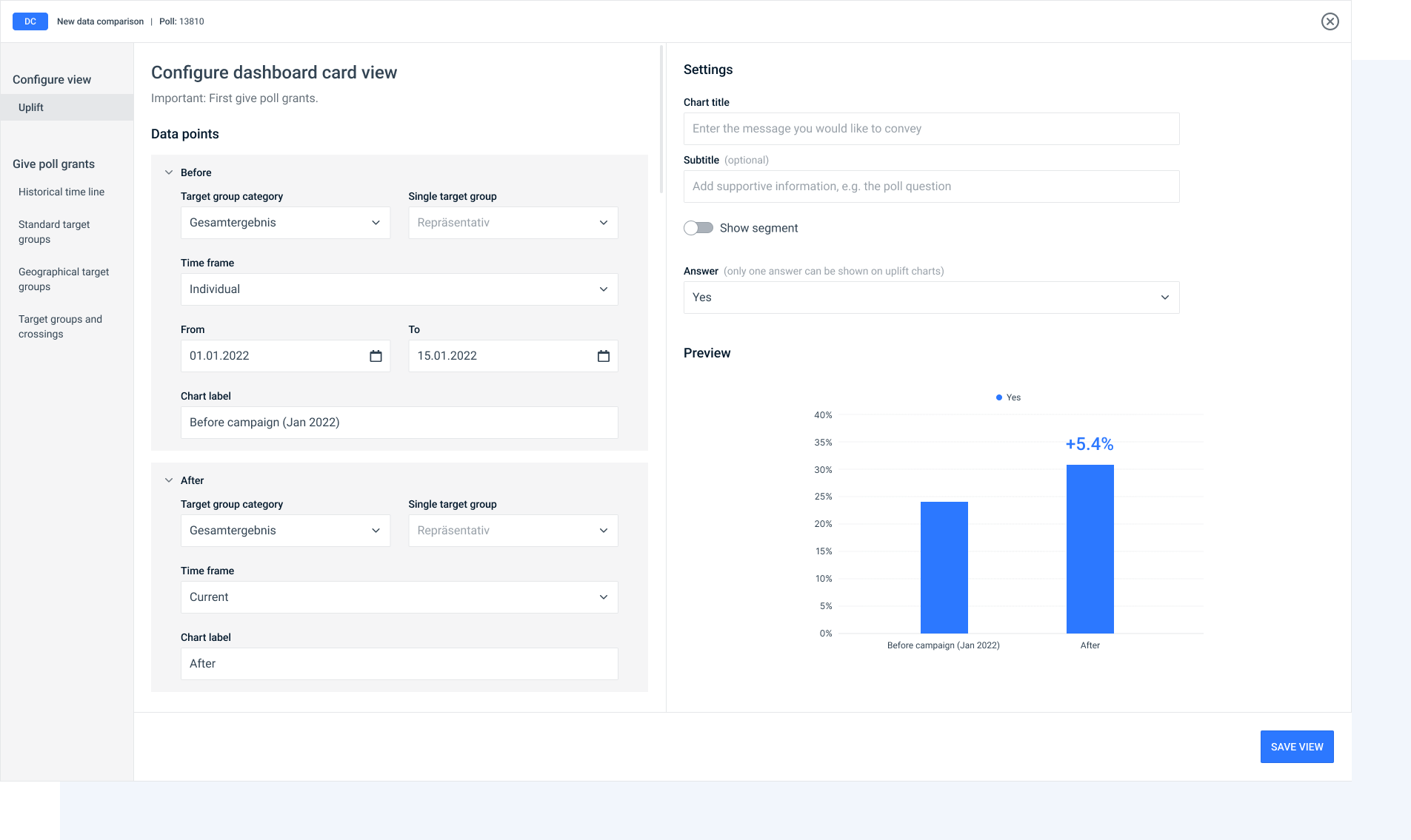
As the designer of the team, my job was to figure out how such charts should look like without making them overly complex. This included not only data visualisation, but also designing the user flow within our internal chart configuration tool.
Approach
Designing charts based on real use cases
Designing something that doesn’t exist yet raises the question where to start. Based on what our clients needed, I defined the following use cases together with my team, consultants and other internal stakeholders:
- Uplift: shows how well a campaign has performed
- Time comparison: shows answers from selected points in time
- Target group comparison: shows answers from selected target groups
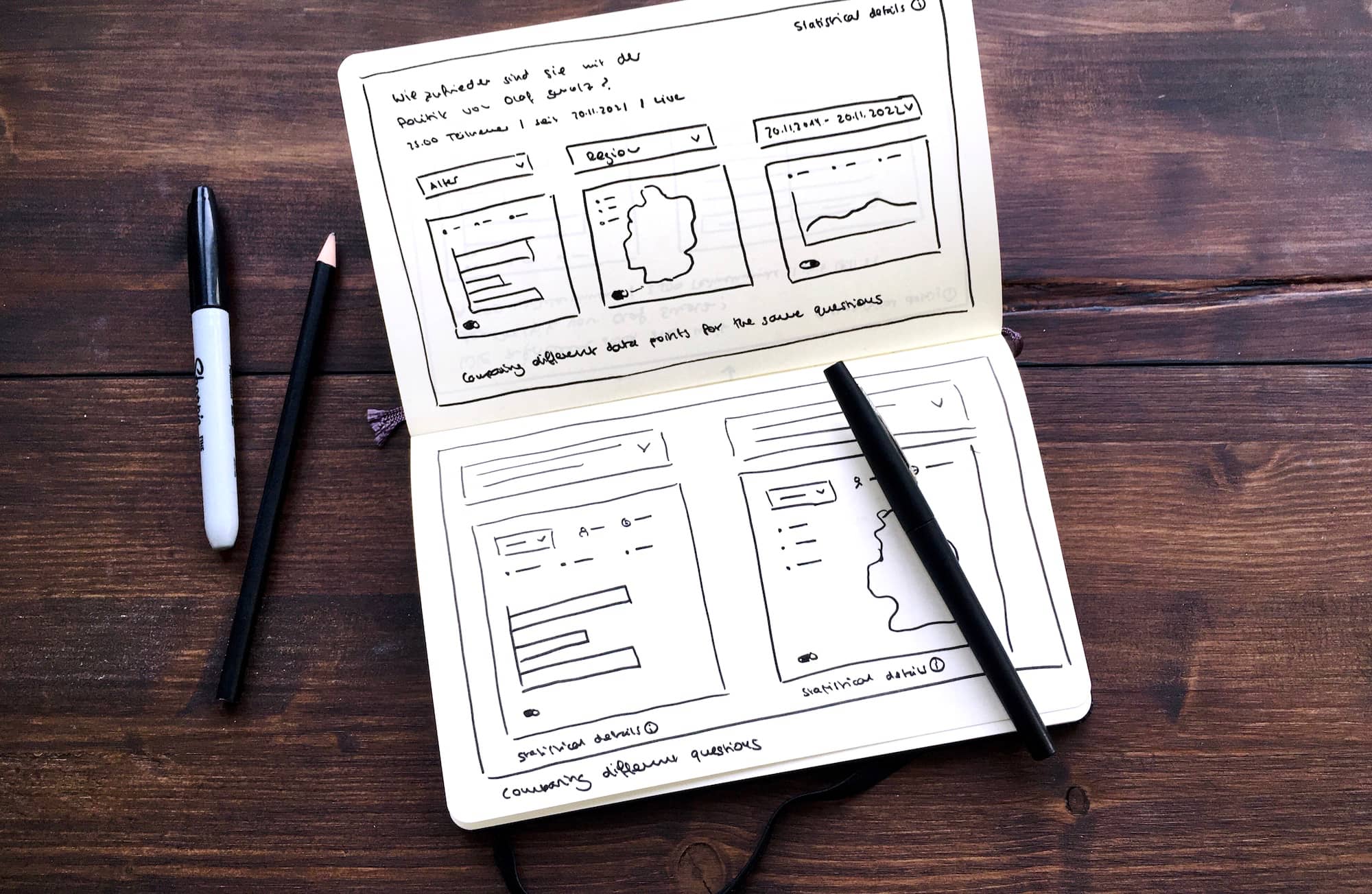
Understanding client needs through our consultants’ lenses
While I initially thought it’s a good idea to give clients as much freedom as possible to extract data and build charts on their own, I soon realised that this power should belong to the consultants. I underestimated the importance of personal consulting and the risk of overwhelming clients, especially those who have little statistical knowledge.
Therefore I spent much time talking to our consultants, trying to undestand their needs and strategies when working with clients. Together we went through several iterations of chart designs, sometimes reducing and sometimes increasing the depth of information.
Staying consistent with other charts
Although it was tempting to come up with new chart designs to support certain information, I had to keep them consistent with the existing “standard” charts. First because they used the same technology and library to display data. Second because they will appear next to standard charts on the same dashboard and might be compared to those.
After chart design was done, I had to define how consultants can build these new charts within the tool they were already using to configure charts and dashboards. Again reusing existing patterns was key so that consultants will have an easy start with the new feature.
Result
What looked easy at the surface evolved into a lot of complexity, different use cases and consistency challenges. Over several iterations I came up with a system that works with all three use cases and leaves space for more. Still when it came to development, we had to be lean and explicit, so my team and I decided to implement the uplift use case first.